CS480X A3: Earth to Mars with Free Return
- 1 minC20, which it turns out will be my final term in person at WPI, wrapped up a couple of weeks ago. My favorite project in those seven weeks was for CS480X Data Visualization. In short, we were tasked with finding an existing visualization and improving it.
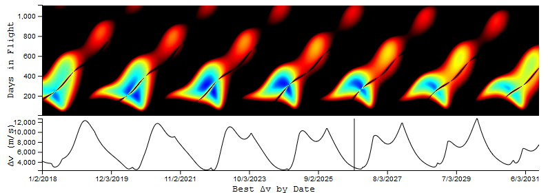
I chose to remix this visualization. We had discussed in class as being a cool idea, but difficult to understand. While someone with a background in spaceflight (or KSP experience) might understand the chart, to anyone else, the diagonal lines and different axes make it challenging to interpret.
My goal was to use linked views as well as an overall improved design to make the same data more accessible to everyone. You can find the end result here.
Changes and additions I made included:
- Keeping the default color scheme mostly the same, with the major exception of changing the background to black for visibility.
-
The user can hover over a point and see linked changes on two views:
- Right below the main visualization is a line chart depicting the optimal delta-v for a each date. A line follows the user’s position on the main chart.
- Three readouts display (in text) the exact values of the user’s mouse position (Date, delta-v, days in flight)
- Finally, I added a color picker that allows the user to modify the color scheme of the main visualization
Implementation notes (and some thoughts on how I might do things differently):
- The main visualization consists of 115,360 individual SVG rectangles, each one pixel. This was the only way I could think of to display such a complex gradient.
- Each pixel included a mouseover listener to update the other views. I probably could have improved this by using mouse events and getting x,y positions.